Customize player branding (Web)
From the Customize Player Branding screen, you can adjust the appearance of the player including display options, colors, logos, and on-click behaviors.
The player supports HEX and RGBA color values for all color customizations. For default color settings, RGBA values are used to add transparency to player elements. Otherwise, default colors are defined with HEX colors.

Customize player appearance
If you are a developer, use the CSS Skinning Reference to customize specific player elements.
Use the following steps to customize the appearance of a player:
- From the Players page, select an existing player. The player builder page appears. If you have clicked Create Web Player to create a new player, the player builder page will also appear.
- Above the player preview, click Customize Player Branding. The Customize Player Branding page appears.
- Customize the logo.
- Customize the controls of the player.
- Customize the menus of the player.
- Customize the tooltips that appear in the player.
- Customize the right-click behavior
- Click Done. The player builder page appears.
- Click Save.
As changes are made to the player settings, these changes appear in the player preview on the right side of the screen in real-time.
Logo
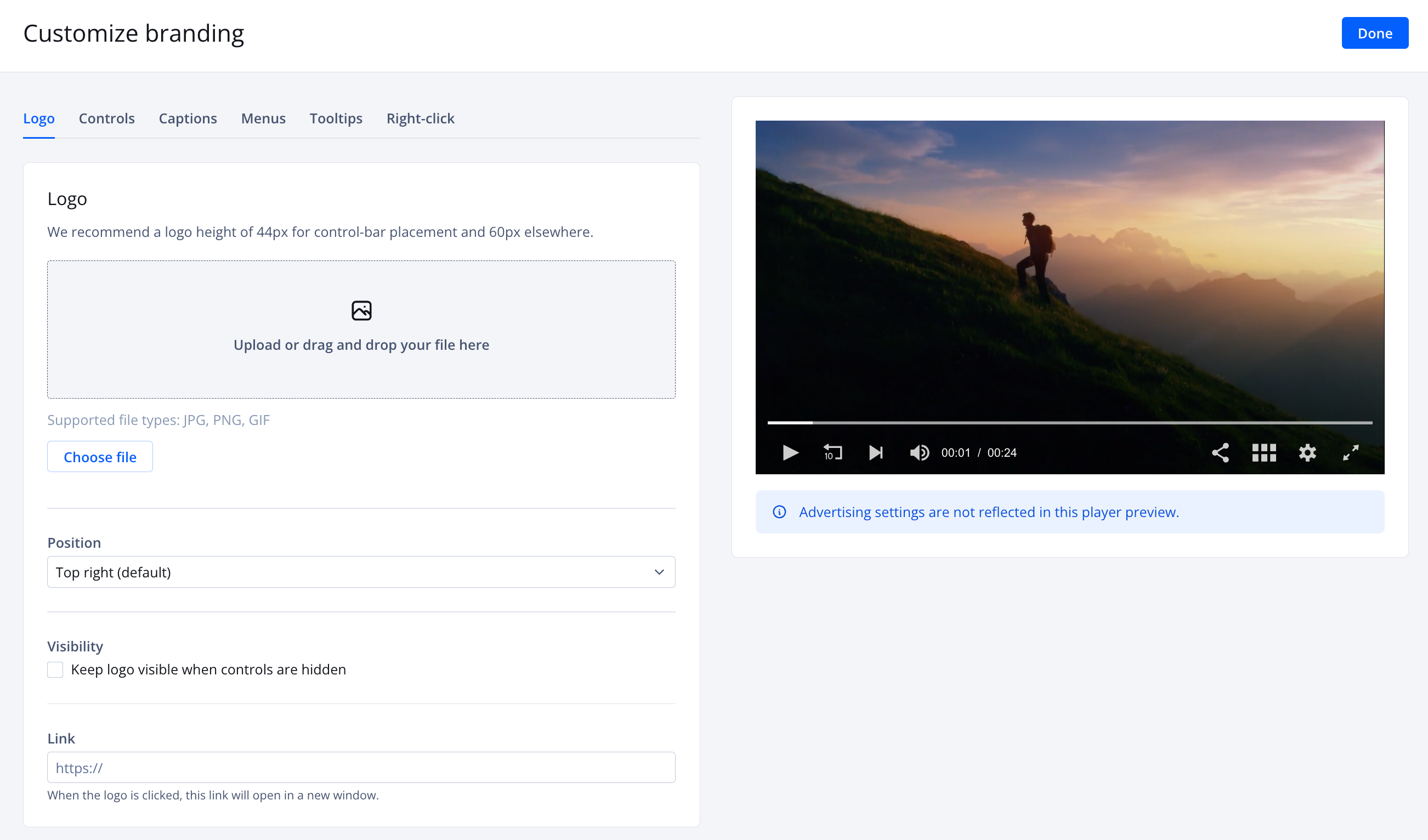
The Logo tab allows you to add branding to the video player. A logo can only be placed in one location per player. If you position the logo in the control bar, use a logo with a height of 44px. Otherwise, use a logo with a height of 60px.
Use the following steps to add a logo:
- On the Logo tab under Logo, drag and drop a logo file. The following file types are supported: .jpg, .png, .gif. You can also click Choose File to upload the logo file from your computer.
- From the Position dropdown menu, choose the placement of the logo on the player.
- Click the Visibility toggle to ON so that the logo persists as an overlay when controls are hidden.
- In the Link textbox, enter a URL. When a URL is provided and the logo is clicked, playback in the player pauses and the URL opens in a new window.
Controls
The Controls tab allows you to customize the colors of the control icons. The following table explains each control option.
| Option | Description |
|---|---|
| Text | Color of any plain text in the control bar of the player |
| Icons | Color of the following icons:
Default: Inactive color of icons Hover: Color of hovered or selected icons |
| Timeslider | Color of time slider elements Progress:
Rail:
|
| Background | Color of the control bar and menu icon bar |
Menus
The Menus tab allows you to customize the colors of the menus. The following table explains each menu option.
| Option | Description |
|---|---|
| Links | Color of the following items:
Default: Inactive, the default color of text Hover: Color of hovered or selected text. There is no hover functionality for the title of the playlist or recommended playlist overlay. |
| Background | Background color of the settings menu and Next Up popup Two additional settings are listed beneath the menu settings:
|
Tooltips
The Tooltips tab allows you to customize the colors of the tooltips. The following table explains each menu option.
| Option | Description |
|---|---|
| Text | Color of tooltip text |
| Background | Background color of tooltips |
Right-Click
When a viewer right-clicks on the player, a menu appears. The Right Click tab allows you to overwrite the Powered by JWX text that can open a new page when clicked by a viewer.
Follow the steps below to edit the right-click menu:
- In the Text field, enter the text to overwrite the Powered by JWX label.
- (Optional) In the Link field, enter a URL. Be sure to add http:// or https:// at the beginning of the URL.
Updated 2 months ago
