Android Style Guide Reference
The player's core interaction elements, organized by their functional groups and location within the interface.
Ads Controls
UiGroup.ADS_CONTROL
ViewModel: VastAdsViewModel
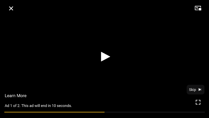
VastAds View
| Icon | Component | Description | Customization Options |
|---|---|---|---|
| The VAST controls background |
Resource: N/A Style: N/A> Colors: @color/jw_controls_overlaySize: N/A |
||
 |
Close | Exit fullscreen icon, shown when the player is in fullscreen, tapping it exits fullscreen |
Resource: @drawable/ic_jw_closeStyle: JWIcon.VastCloseColors:
@dimen/jw_icon
|
 |
Picture-in-Picture | PiP icon, tapping it puts the player/activity in PiP mode |
Resource: @drawable/ic_jw_pipStyle: JWIcon.VastPipColors:
@dimen/jw_icon
|
 |
Play | Play icon, tapping it resumes the ad |
Resource: @drawable/ic_jw_playStyle: JWIcon.VastPlayColors:
@dimen/jw_large_icon
|
 |
Pause | Pause icon, tapping it pauses the ad |
Resource: @drawable/ic_jw_pauseStyle: JWIcon.VastPlayColor:
@dimen/jw_large_icon
|
 |
Learn More | Learn More button, tapping it redirects the user to the ad's clickthrough URL |
Resource: @string/jwplayer_learn_moreStyle: JWText.VastLearnMoreColor: @color/jw_labels_primarySize: @dimen/jw_text_large
|
 |
Ad message, configurable via the string resources |
Resources:
JWText.VastAdMessageColor: @color/jw_labels_primarySize: @dimen/jw_text_small
|
|
 |
Ad progress |
Resource: @drawable/jw_vast_seek_progress_drawableStyle: VastProgressColor: @color/jw_vast_progressSize: @dimen/jw_seekbar_thickness
|
|
 |
Progressbar background |
Resource: @drawable/jw_vast_seek_progress_drawableStyle: VastProgressColor: @color/jw_seekbar_backgroundSize: @dimen/jw_seekbar_thickness
|
|
 |
Skip | Skip button |
Resources:
JWText.VastSkipColors:
@dimen/jw_text_small
|
 |
Fullscreen (Enter) | Enter fullscreen icon, shown when the player is not in fullscreen, tapping it enters fullscreen |
Resource: @drawable/ic_jw_enter_fullscreenStyle: JWIcon.VastFullscreenColors:
@dimen/jw_icon
|
 |
Fullscreen (Exit) | Exit fullscreen icon, shown when the player is in fullscreen, tapping it exits fullscreen |
Resource: @drawable/ic_jw_exit_fullscreenStyle: JWIcon.VastFullscreenColors:
@dimen/jw_icon
|
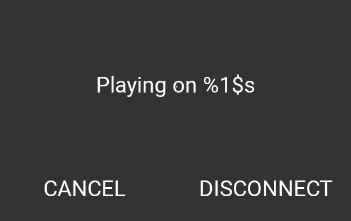
Cast Dialog
| Icon | Component | Description | Customization Options |
|---|---|---|---|
| The Cast Dialog background |
Resource: @drawable/bg_jw_cast_disconnect_dialogStyle: JWView.CastDialogColor: @color/jw_surface_quaternarySize: N/A |
||
 |
Playing on {device} | Indicates which device you are currently casting to |
Resource: @string/jwplayer_cast_playing_onStyle: JWText.CastDialogDeviceColor: @color/jw_labels_primarySize: @dimen/jw_text_large
|
 |
Cancel | Closes the Cast Disconnect Dialog |
Resource: @string/jwplayer_cancelStyle: JWText.CastDialogCancelColor: @color/jw_labels_primarySize: @dimen/jw_text_large
|
 |
Disconnect | Disconnects from the casting device and resumes playback on the mobile device |
Resource: @string/jwplayer_cast_disconnectStyle: JWText.CastDialogDisconnectColor: @color/jw_labels_primarySize: @dimen/jw_text_large
|
Casting Menu
UiGroup.CASTING_MENU
ViewModel: CastingMenuViewModel
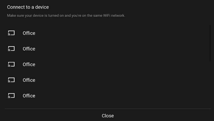
CastingMenuView
| Icon | Component | Description | Customization Options |
|---|---|---|---|
| The menu background |
Resource: @drawable/bg_jw_menuStyle: JWView.Menu.CastColors: @color/jw_surface_secondarySize: N/A |
||
 |
Title and call to action for the casting menu |
Resource: @string/jwplayer_cast_connect_to_a_deviceStyle: JWText.CastTitleColors: @color/jw_labels_primarySize: @dimen/jw_text_xlarge
|
|
 |
Hint that your mobile device needs to be connected to the same network as the cast device |
Resource: @string/jwplayer_cast_use_same_wifiStyle: JWText.CastSubtitleColors: @color/jw_labels_secondarySize: @dimen/jw_text_xsmall
|
|
 |
Icon to indicate a cast device |
Resource: @drawable/ic_jw_cast_offStyle: JWIcon.CastItemColors:
@dimen/jw_icon
|
|
 |
Name of the cast device |
Resource: N/A Style: JWText.CastItemColor: @color/jw_labels_primarySize: @dimen/jw_text_xlarge
|
|
 |
Divider | Divider |
Resource: N/A Style: JWHorizontalDivider.CastColors: @color/jw_separator_non_opaqueSize: N/A |
 |
Close button |
Resource: @string/jwplayer_closeStyle: JWText.CastCloseColors: @color/jw_labels_primarySizes:
|
Center Controls
UiGroup.CENTER_CONTROLS
ViewModel: N/A
The primary playback controls displayed in the center of the player.
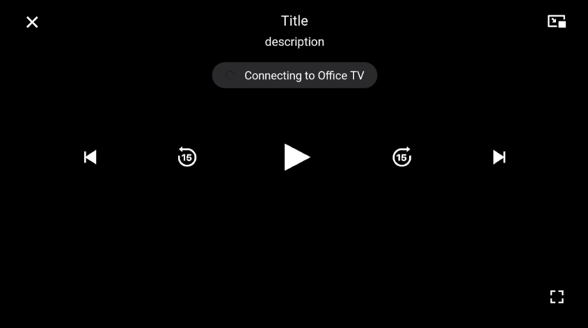
CenterControls view
| Icon | Component | Description | Customization Options |
|---|---|---|---|
| Center Controls Background | CenterControls background |
Resource: @drawable/bg_jw_center_controlsStyle: JWView.CenterControlsColors: @color/jw_controls_overlaySize: N/A |
|
|
Close | Shown when player is in fullscreen mode
Clicking this icon exits fullscreen mode. |
Resource: @drawable/ic_jw_closeStyle: JWIcon.CenterControlsCloseColors:
@dimen/jw_icon
|
 |
Title | Displays the title of the current playlist item |
Resource: N/A Style: JWText.CenterControlsTitleColor: @color/jw_labels_primarySize: N/A |
 |
Description | Displays the description of the current playlist item |
Resource: N/A Style: JWText.CenterControlsDescriptionColor: @color/jw_labels_primarySize: N/A |
 |
Connecting to {device} | Heads-up display (HUD) shown when the player attempts to connect to the device |
The following settings define the background.
Resource: @drawable/bg_jw_cast_connectingStyle: JWContainer.CenterControlsCastIndicatorColor: @color/jw_fill_primarySize: N/A |
|
The following settings define the text (string).
Resource: @string/jwplayer_cast_connecting_toStyle: JWText.CenterControlsCastStatusColors: @color/jw_labels_primarySize: N/A |
|||
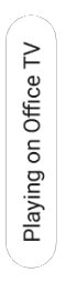 |
Playing on {device} | Heads-up display (HUD) shown when the player is casting to the device |
The following settings define the background.
Resource: @drawable/bg_jw_cast_readyStyle: JWContainer.CenterControlsCastIndicatorColor: @color/jw_labels_primarySize: N/A |
|
The following settings define the text (string).
Resource: @string/jwplayer_cast_playing_onStyle: JWText.CenterControlsCastStatusColors: @color/jw_surface_secondarySize: N/A |
|||
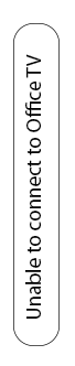 |
Unable to connect to {device} | Heads-up display (HUD) shown when the player cannot connect to the device |
The following settings define the background.
Resource: @drawable/bg_jw_cast_readyStyle: JWContainer.CenterControlsCastIndicatorColor: @color/jw_labels_primarySize: N/A |
|
The following settings define the text (string).
Resource: @string/jwplayer_cast_unable_to_connect_toStyle: JWText.CenterControlsCastStatusColors: @color/jw_surface_secondarySize: N/A |
|||
|
Picture-in-Picture | Shown when the system supports picture-in-picture (PiP) |
Resource: @drawable/ic_jw_pipStyle: JWIcon.CenterControlsPipColors:
@dimen/jw_icon
|
 |
Rewind | Rewinds 15 seconds when tapped |
Resource: @drawable/ic_jw_rewind_15Style: JWIcon.CenterControlsRewindColors:
@dimen/jw_large_icon
|
|
Play | Displays when the player is paused or idle |
Resource: @drawable/ic_jw_playStyle: JWIcon.CenterControlsPlayColors:
@dimen/jw_large_icon
|
|
Pause | Displays during active playback |
Resource: @drawable/ic_jw_pauseStyle: JWIcon.CenterControlsPauseColors:
@dimen/jw_large_icon
|
 |
Replay | Displays after playback has completed |
Resource: @drawable/ic_jw_replayStyle: JWIcon.CenterControlsRepeatColors:
@dimen/jw_large_icon
|
 |
Buffer Spinner | Displays during content buffering |
Resource: @drawable/ic_jw_bufferStyle: JWIcon.CenterControlsBufferColors:
@dimen/jw_large_icon
|
 |
Forward | Advances 15 seconds when tapped |
Resource: @drawable/ic_jw_fast_forward_15Style: JWIcon.CenterControlsForwardColors:
@dimen/jw_large_icon
|
 |
Next | Advances to next playlist item |
Resource: @drawable/ic_jw_nextStyle: JWIcon.CenterControlsNextColors:
@dimen/jw_large_icon
|
|
Fullscreen (Enter) | Displays when the player is not in fullscreen |
Resources: @drawable/ic_jw_enter_fullscreenStyle: JWIcon.CenterControlsFullscreenColors:
@dimen/jw_icon
|
|
Fullscreen (Exit) | Displays when the player is in fullscreen |
Resources: @drawable/ic_jw_exit_fullscreenStyle: JWIcon.CenterControlsFullscreenColors:
@dimen/jw_icon
|
Chapters
UiGroup.CHAPTERS
ViewModel: ChaptersViewModel
ChaptersView
| Icon | Component | Description | Customization Options |
|---|---|---|---|
| The menu background |
Resource: @drawable/bg_jw_menuStyle: JWView.Menu.ChaptersColor: @color/jw_surface_secondarySize: N/A |
||
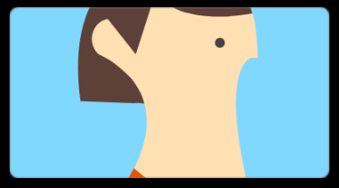 |
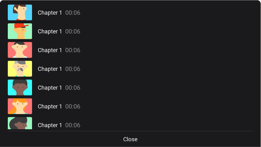
Chapter Thumbnail | The thumbnail of the chapter. Derived from the chapters VTT file |
Resource: N/A Styles:
Size: @dimen/jw_icon
|
 |
Chapter Title | Name of the chapter |
Resource: N/A Style: JWText.ChaptersItemTitleColor: @color/jw_labels_primarySize: @dimen/jw_text_xlarge
|
 |
Chapter Start | Time the chapter begins |
Resource: N/A Style: JWText.ChaptersItemPositionColor: @color/jw_labels_secondarySize: @dimen/jw_text_xxlarge
|
|
Divider | Divider meant to divide the list from the close button |
Resource: N/A Style: JWHorizontalDivider.ChaptersColor: @color/jw_separator_non_opaqueSize: N/A |
|
Close | Close button |
Resource: @string/jwplayer_closeStyle: JWText.ChaptersCloseColor: @color/jw_labels_primarySizes:
|
Control Bar
UiGroup.CONTROLBAR
ViewModel: ControlbarViewModel
The bottom control interface containing advanced playback options.
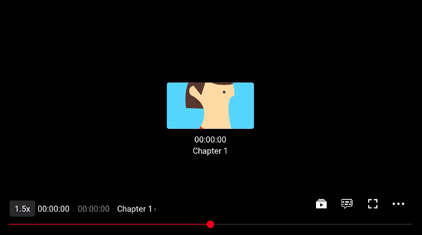
ControlbarView
| Icon | Component | Description | Customization Options |
|---|---|---|---|
| Control Bar Background | Controlbar background |
Resource: @drawable/bg_jw_controlbar_contrast_gradientStyle: JWView.ControlbarColors:
|
|
 |
Playback Speed | Displays when content playback speed is not 1x |
Resource: @drawable/bg_jw_controlbar_ratesStyle: JWText.ControlbarRateColor: @color/jw_fill_primarySize:
|
|
Current playback position timestamp |
Resource: N/A Style: JWText.ControlbarPositionColor: @color/jw_labels_primarySize: @dimen/jw_text_medium
|
|
 |
Separator between position and duration |
Resource: @string/jwplayer_control_bar_timer_delimiterStyle: JWText.ControlbarPositionDividerColor: @color/jw_surface_secondarySize: @dimen/jw_text_medium
|
|
|
Current video's duration |
Resource: N/A Style: JWText.ControlbarDurationColor: @color/jw_labels_secondarySize: @dimen/jw_text_medium
|
|
 |
Separator between duration and chapter |
Resource: @string/jwplayer_dot_separatorStyle: JWText.ControlbarChaptersDividerColor: @color/jw_surface_secondarySize: @dimen/jw_text_medium
|
|
|
Name of the current chapter. Tapping on this will open the Chapters menu |
Resource: N/A Style: JWText.ControlbarChaptersTitleColor: @color/jw_labels_primarySize: @dimen/jw_text_medium
|
|
 |
Indicator to show that more chapters exist |
Resource: @string/jwplayer_arrow_indicatorStyle: JWText.ControlbarChaptersIndicatorColor: @color/jw_labels_secondarySize: @dimen/jw_text_medium
|
|
 |
Captions (Off) | Closed captions toggle. Tapping this will toggle captions if only one track exists or open the captions menu if more exist. This icon indicates that the captions are off |
Resource: @drawable/ic_jw_captions_offStyle: JWIcon.ControlbarCaptionsColors:
@dimen/jw_icon
|
 |
Captions (On) | This icon indicates that the captions are on |
Resource: @drawable/ic_jw_captions_onStyle: JWIcon.ControlbarCaptionsColors:
@dimen/jw_icon
|
 |
More Videos | Tapping this opens the playlist view |
Resource: @drawable/ic_jw_more_videosStyle: JWIcon.ControlbarPlaylistColor:
@dimen/jw_icon
|
|
Fullscreen (Enter) | Enter fullscreen icon, tapping this puts the player in fullscreen |
Resources: @drawable/ic_jw_enter_fullscreenStyle: JWIcon.ControlbarFullscreenColors:
@dimen/jw_icon
|
|
Fullscreen (Exit) | Exit fullscreen icon, tapping this takes the player out of fullscreen |
Resources: @drawable/ic_jw_exit_fullscreenStyle: JWIcon.ControlbarFullscreenColors:
@dimen/jw_icon
|
 |
Settings | Settings icon, tapping this opens the settings menu |
Resource: @drawable/ic_jw_settingsStyle: JWIcon.ControlbarMenuColors:
@dimen/jw_icon
|
 |
Live | Live Indicator |
Resource: @string/jwplayer_live_broadcastStyle: JWRadio.ControlbarLiveColor: @color/jw_labels_primarySize: @dimen/jw_text_xsmall
|
Resource: @drawable/jw_controlbar_live_buttonStyle: JWRadio.ControlbarLiveColors:
|
|||
 |
The current progress of the seekbar |
Resource: N/A Style: JWControlbarSeekColor: @color/jw_seekbar_progressSize: @dimen/jw_seekbar_thickness
|
|
| Marker signifying an ad was scheduled in the timeline |
Resource: N/A Style: JWControlbarSeekColor: @color/jw_seekbar_ads_markerSize:
|
||
| Marker signifying a chapter begins |
Resource: N/A Style: JWControlbarSeekColor: @color/jw_seekbar_chapter_markerSize:
|
||
| Highlights the timeline between the start of the current chapter and the start of the next |
Resource: N/A Style: JWControlbarSeekColors: @color/jw_seekbar_chapter_highlightSize: @dimen/jw_seekbar_thickness
|
||
 |
The seekbar thumb |
Resource: @drawable/jw_controlbar_seek_thumbStyle: JWControlbarSeekColor: @color/jw_seekbar_thumbSize: @dimen/jw_seekbar_thumb
|
|
| The seekbar secondary progress, this indicates the amount of buffered video |
Resource: N/A Style: JWControlbarSeekColor: @color/jw_seekbar_secondary_progressSize: @dimen/jw_seekbar_thickness
|
||
|
The seekbar background, this indicates the size of the seekbar |
Resource: N/A Style: JWControlbarSeekColors: @color/jw_seekbar_backgroundSize: @dimen/jw_seekbar_thickness
|
|
| Thumbnail preview, updates the bitmap based on the position you are scrubbing. |
Resources: N/A Style:
@color/jw_fill_primarySize: N/A |
||
| The position you are scrubbing to |
Resource: N/A Style: JWText.ControlbarThumbnailTimestampColors: @color/jw_labels_primarySize: @dimen/jw_text_medium
|
||
| The chapter you are scrubbing to |
Resource: N/A Style: JWText.ControlbarThumbnailChapterColors: @color/jw_labels_primarySize: @dimen/jw_text_medium
|
Error Overlay
UiGroup.ERROR
ViewModel: ErrorViewModel
Error overlay displaying a playback error.
ErrorView
| Icon | Component | Description | Customization Options |
|---|---|---|---|
| Error Background | Error overlay background |
Resource: @drawable/bg_jw_errorStyle: JWContainer.ErrorColors: @color/jw_surface_primarySize: N/A |
|
 |
Error | Error indicator |
Resource: @drawable/ic_jw_playStyle: JWImage.ErrorIconColors: @color/jw_icons_activeSize: @dimen/jw_large_icon
|
 |
Error Message | Error message |
Resource: N/A Style: JWText.ErrorMessageColor: @color/jw_labels_primarySize: @dimen/jw_text_medium
|
 |
Error Code | Error Code |
Resource: N/A Style: JWText.ErrorCodeColor: @color/jw_labels_secondarySize: @dimen/jw_text_xxsmall
|
Menu
UIGroup.SETTINGS_MENU
ViewModel: SettingsMenuViewModel
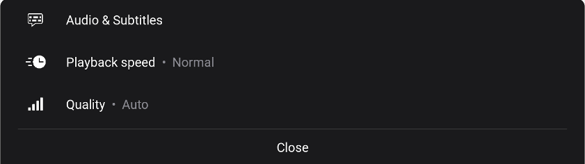
MenuView
| Icon | Component | Description | Customization Options |
|---|---|---|---|
| The menu background |
Resource: @drawable/bg_jw_menuStyle: JWView.Menu.SettingsColors: @color/jw_surface_secondarySize: N/A |
||
|
Audio & Subtitles | Icon for alternate audio and captions. Tapping this takes you to the Audio & Subtitles submenu |
Resource: @drawable/ic_jw_captions_offStyle: JWIcon.MenuOptionColors:
|
 |
Audio & Subtitles | Label for the Audio & Subtitles submenu |
Resource: @string/jwplayer_audio_and_subtitlesStyle: JWText.MenuOptionLabelColor: N/A Size: @dimen/jw_text_xlarg
|
 |
Icon for playback speed. Tapping this takes you to the Playback speed submenu |
Resource: @drawable/ic_jw_playStyle: JWIcon.MenuOptionColors:
|
|
 |
Label for the Playback Speed submenu |
Resource: @string/jwplayer_playback_ratesStyle: JWText.MenuOptionLabelColor: @color/jw_labels_primarySize: @dimen/jw_text_xlarge
|
|
 |
Indicator showing the current Playback Speed |
Resource: N/A Style: JWText.MenuOptionValueColor: @color/jw_labels_secondarySize: @dimen/jw_text_xlarge
|
|
 |
Quality | Icon for video quality. Tapping this takes you to the qualities submenu |
Resource: @drawable/ic_jw_quality_100Style: JWIcon.MenuOptionColors:
|
 |
Label for the Quality submenu |
Resource: @string/jwplayer_qualityStyle: JWText.MenuOptionLabelColor: @color/jw_labels_primarySize: @dimen/jw_text_xlarge
|
|
 |
Indicator showing the current Quality |
Resource: N/A Style: JWText.MenuOptionValueColor: @color/jw_labels_secondarySize: @dimen/jw_text_xlarge
|
|
|
Divider | Divider meant to divide the list from the close button |
Resource: N/A Style: JWHorizontalDivider.MenuColors: @color/jw_separator_non_opaqueSize: N/A |
|
Close | Close button |
Resource: @string/jwplayer_closeStyle: JWText.MenuCloseColor: @color/jw_labels_primarySizes:
|
Next Up
UiGroup.NEXT_UP
ViewModel: NextUpViewModel
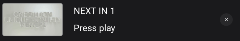
NextUpView
| Icon | Component | Description | Customization Options |
|---|---|---|---|
| The NextUp background |
Resource: @drawable/bg_jw_next_upStyle: JWView.NextUpColor: @color/jw_surface_secondarySize: @dimen/jw_nextup_view_height
|
||
 |
Poster image for the next up playlist item as defined by the metadata provided to the player. |
Resource: N/A Style: JWImage.NextUpPosterColor: @color/jw_fill_primarySize: N/A |
|
 |
Countdown indicating that the next video is about to begin |
Resource: @string/jwplayer_next_up_countdownStyle: JWText.NextUpCountdownColor: @color/jw_labels_primarySize: N/A |
|
 |
The title of the next playlist item as defined by the metadata provided to the player |
Resource: N/A Style: JWText.NextUpTitleColor: @color/jw_labels_primarySize: N/A |
|
|
Close | Dismiss button, dismisses the next up prompt |
Resources:
JWIcon.NextUpCloseColors:
|
Updated about 1 year ago